


※当サイトにはプロモーションが含まれます。
まずは気になるジャンルを
\ CLICK!! /
BLOG
ブログ
ブログの始め方

STEP1
事前に知っておきたいこと
一般人の平均ブログ収入はいくら?

STEP2
初心者向けブログの始め方
ブログ収益化までの⑤つの手順

STEP3
ブログの書き方
WordPressの基本的な使い方

STEP4
ブログの稼ぎ方
ブログ収入を増やす正しい手順
Affiliate
アフィリエイト
おすすめASP
おすすめASP
A8.net
国内No.1サービス
おすすめASP
もしもアフィリエイト
通販サイトの利用に最適
おすすめASP
VALUE COMMERCE
Yahoo関連広告に強い
おすすめASP
afb
厳選されたアフィリエイト広告
WordPress Theme
ワードプレステーマ
おすすめテーマ
シンプルなサイトを作るなら
SWELL
かっこいいサイトを作るなら
AFFINGER6
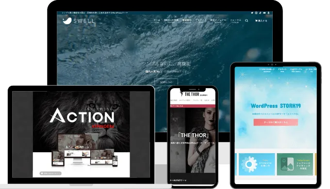
ワードプレステーマ
有料・無料おすすめ9選
おすすめ記事
-

オンラインカジノのねずみ溝やマルチに注意!勧誘手口を解説

-
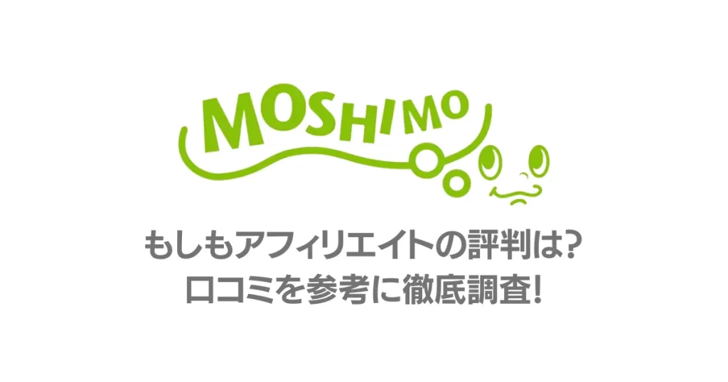
もしもアフィリエイトの評判 口コミを参考に徹底調査
-

ゲーミングアフィリエイトは違法なのか?徹底解説
-
A8ネットでインスタアフィリエイトを始める手順と押さえておきたい注意事項
-
バリューコマースは怪しい?口コミや評判をアンケート調査
-

AFFINGER6の購入方法からインストールまで 導入手順を徹底解説【2023年完全版】
-

サムライクリックの評判 どんなアフィリエイトサービスなのか?徹底解説
-
マネートラックは稼げない?口コミや評判をアンケート調査
-
A8ネットは稼げない?7つの理由と稼ぐコツを解説